


How do you re-energise
a British icon?
Re-energising a cultural icon, to return it to the heart of everyday life. Unifying design and purpose to reawaken Lucozade’s spirit and reshape its presence for a new generation.
-
Lucozade, a 97-year-old British energy drink icon, had become segmented and visually cluttered as its Energy, Sport, and Zero variants evolved separately. The brand lacked a unified identity that conveyed its core promise, diluting its shelf impact and emotional connection with both long-time fans and new consumers
-
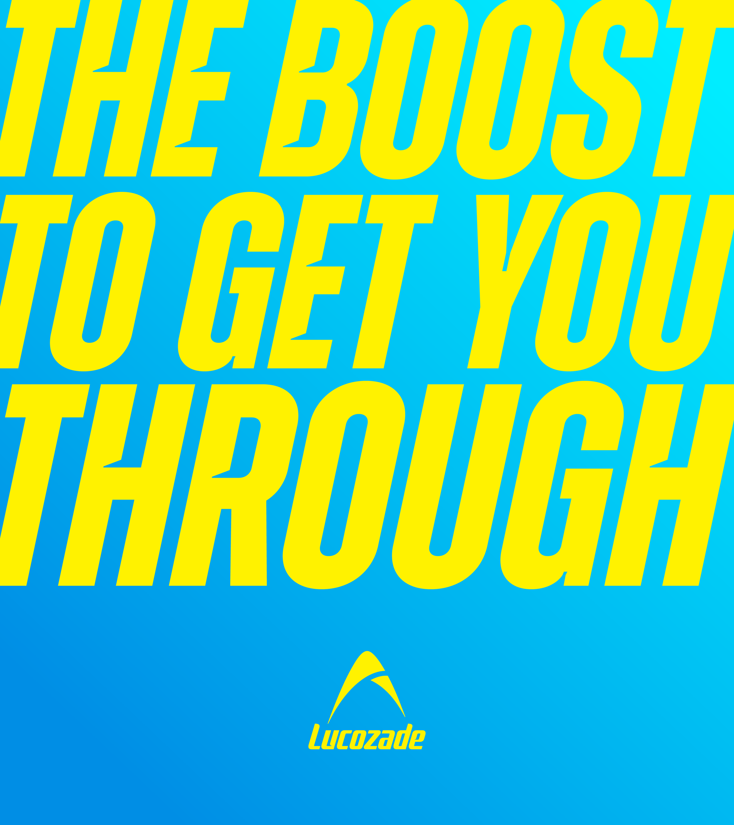
Unifying Lucozade through a masterbrand approach - each range was considered both independently, and as part of a wider holistic system. Liberating the arc and modernising the logo we created a clearer sense of uplift and optimism. Distinctive graphic systems for each range, help differentiate products while maintaining visual unity in how they are built.
-
Acted as a key part to the design team from the beginning of the packaging rebrand, through to the finalisation of the brand world, as well as leading various limited editions along the journey.
Briefed and collaborated with disciplines spanning motion, artwork, typography and CGI, both internally and externally.